Website Redesign
A cleaner route to stores, products, and nutrition details.
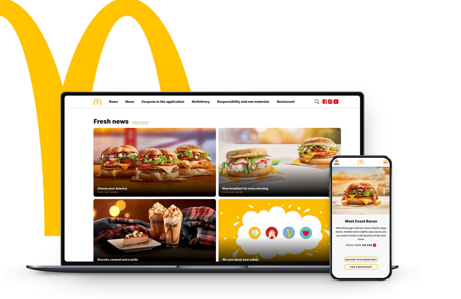
Fresh look. Faster routes.
This redesign covered information architecture, wireframes, prototypes, UX writing, testing, final UI, and motion details. The goal was simple: give McDonald's a more modern digital presence while helping people reach key content with less effort.
Start with the structure
The first step was reorganizing the content so people could find products, stores, and practical information without digging. A better tree made the rest of the redesign easier to trust and easier to use.
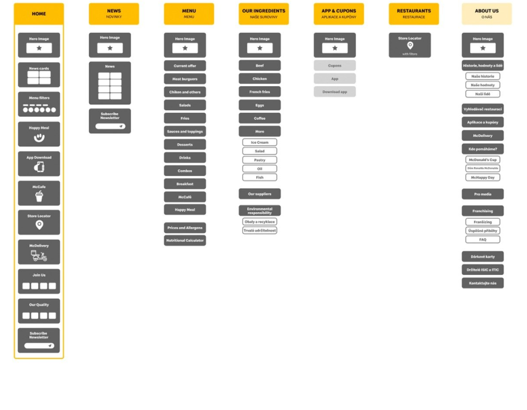
Prototype the route before polishing the look
Wireframes and early prototypes helped test page priorities, category logic, and browsing flow before the final visuals were locked in.
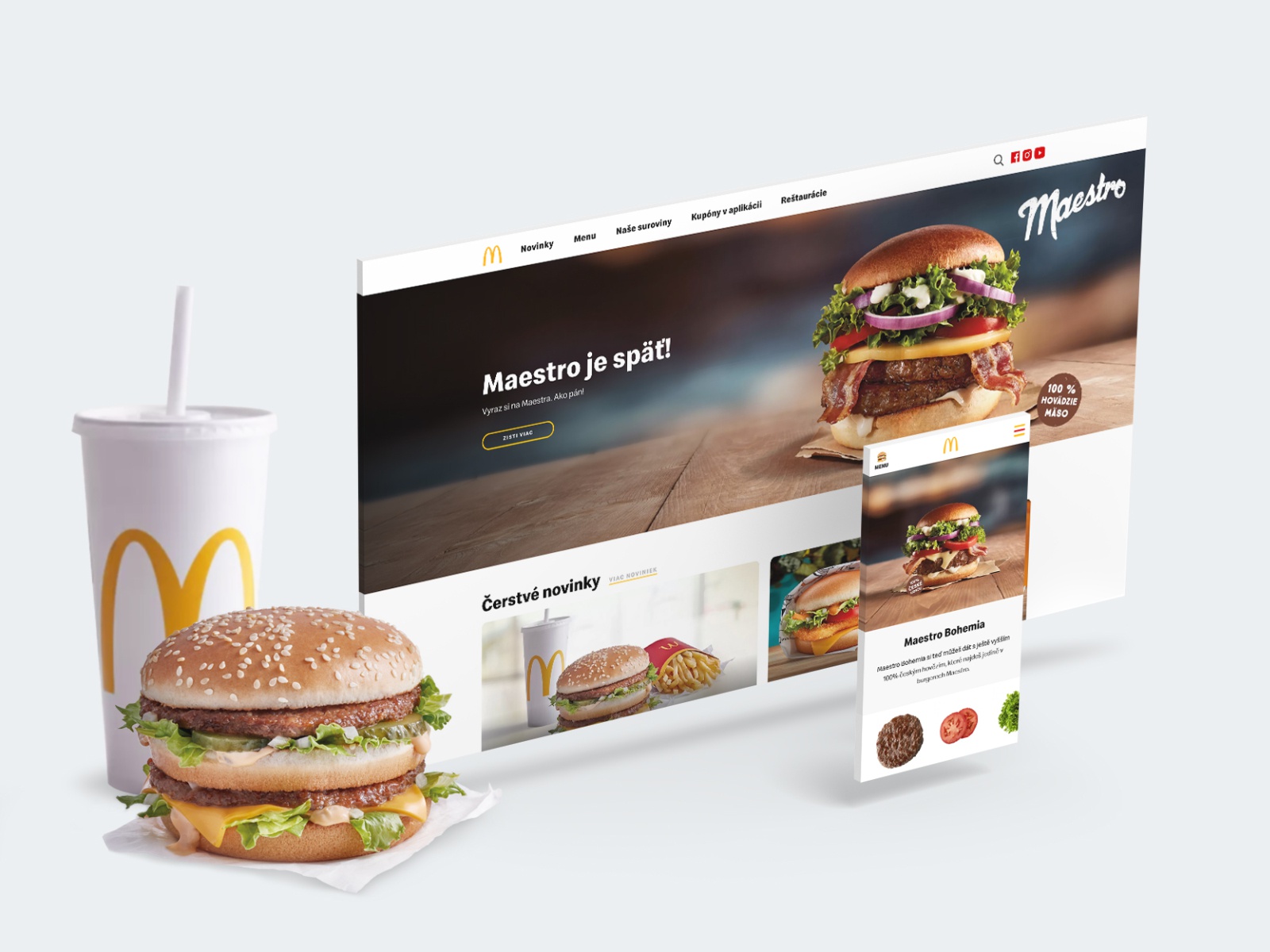
Minimal UI. Big appetite.
The final interface kept the chrome light and let the products carry the attention. Large visuals and simple navigation made the site feel more direct and more appetizing.
Rethinking discovery
Store search needed to work fast. We improved filters like McCafé, Kids Area, and opening times so people could find the right restaurant with less scanning and less doubt.

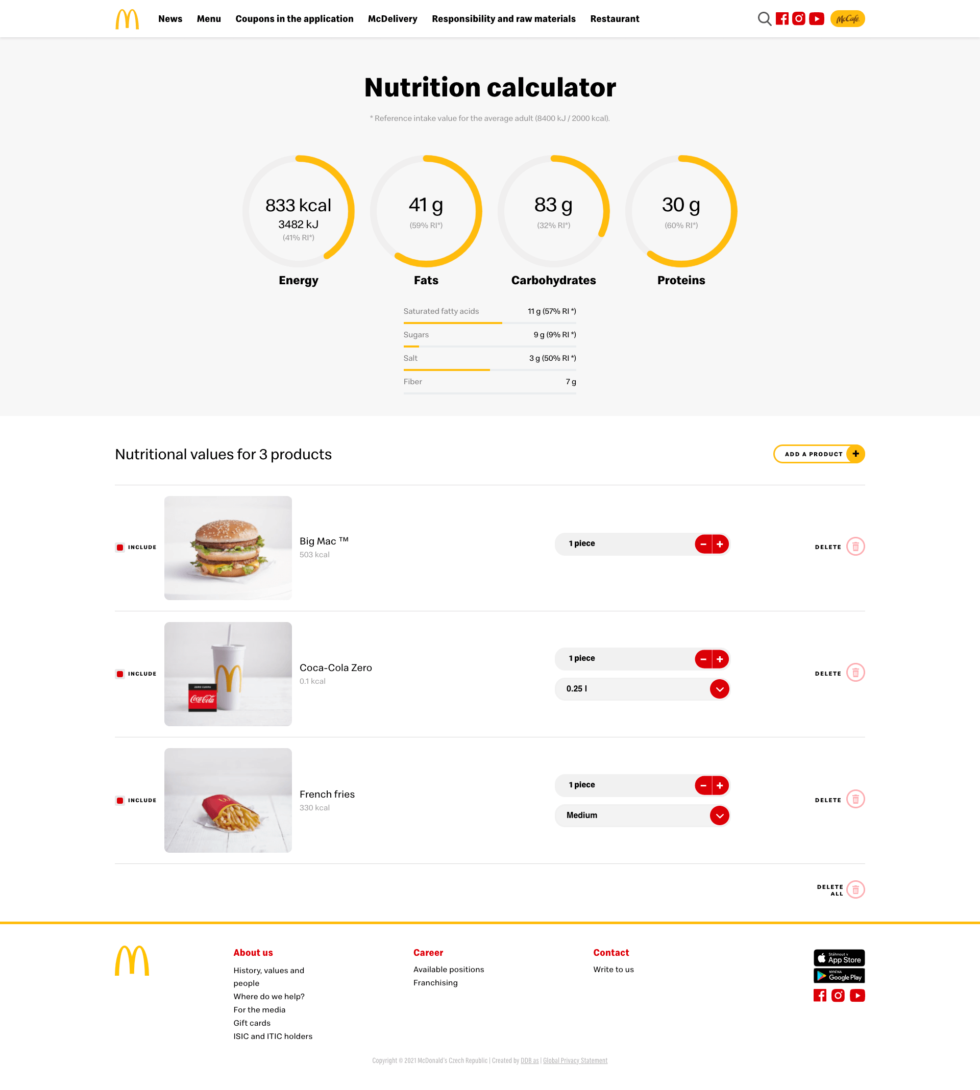
Help people understand what they eat
The nutritional calculator turned dense product data into something much easier to compare. It supported a practical need without making the experience feel heavy.
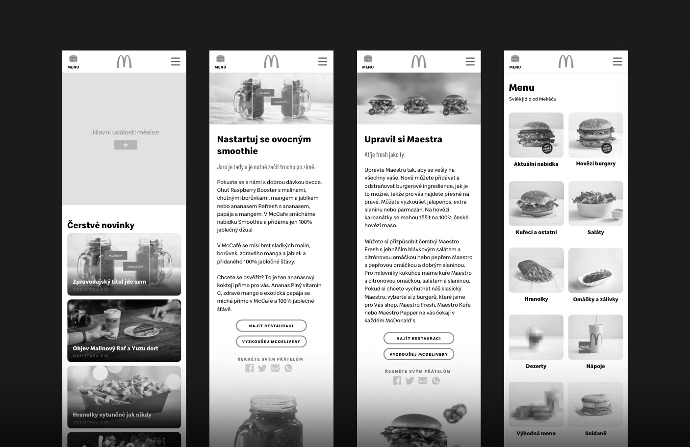
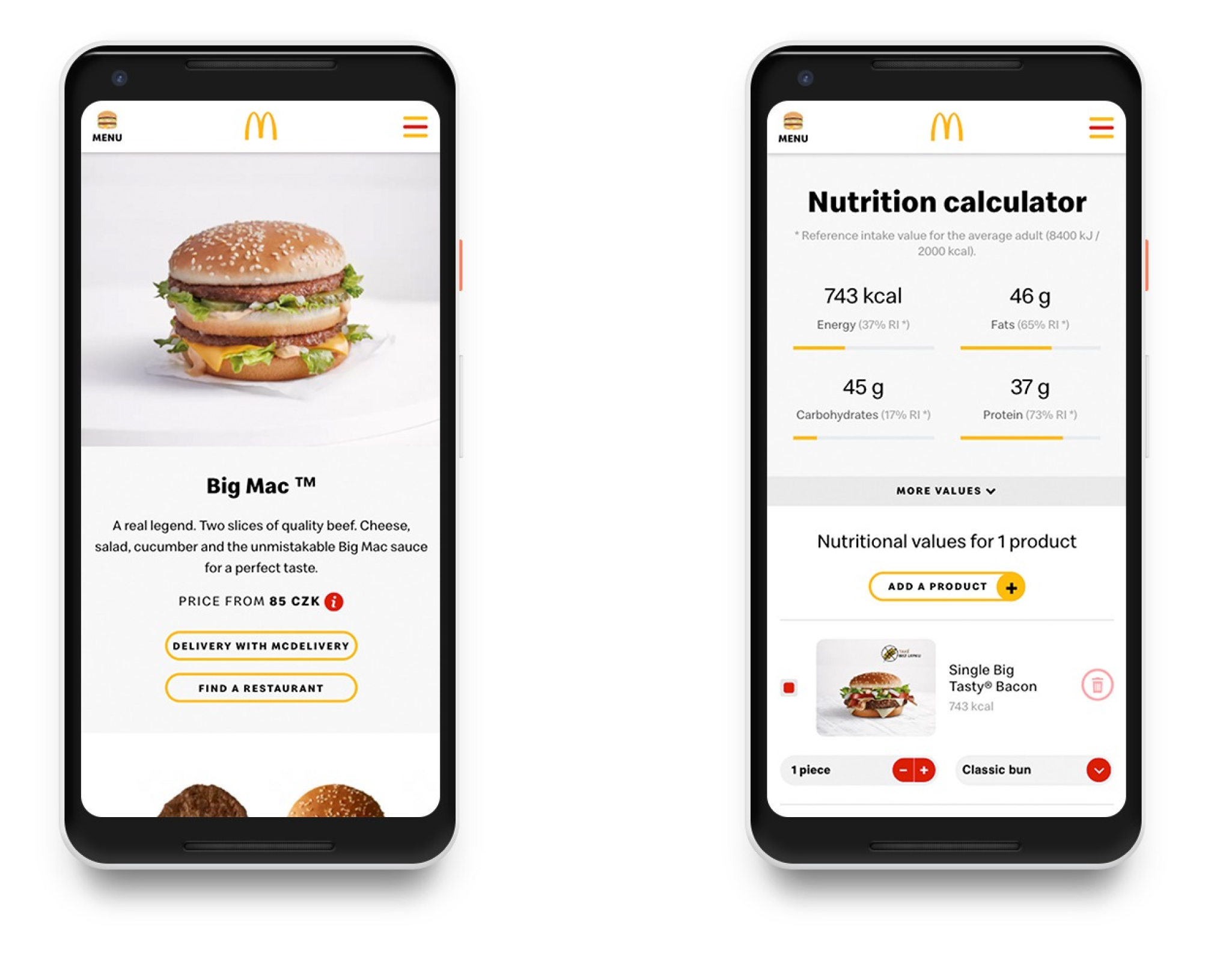
Small screen, same clarity
Mobile layouts kept the same priorities: clear routes, easy scanning, and fast access to product details and nutritional information.
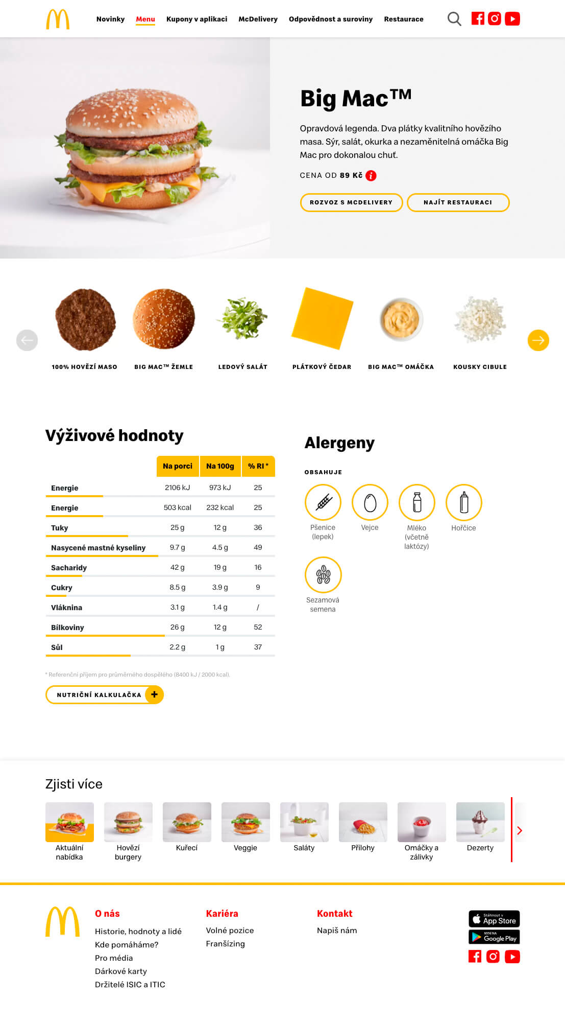
More detail, less friction
The new product page made ingredients, nutrition, and visuals easier to scan. It gave each product more presence while keeping the structure light.
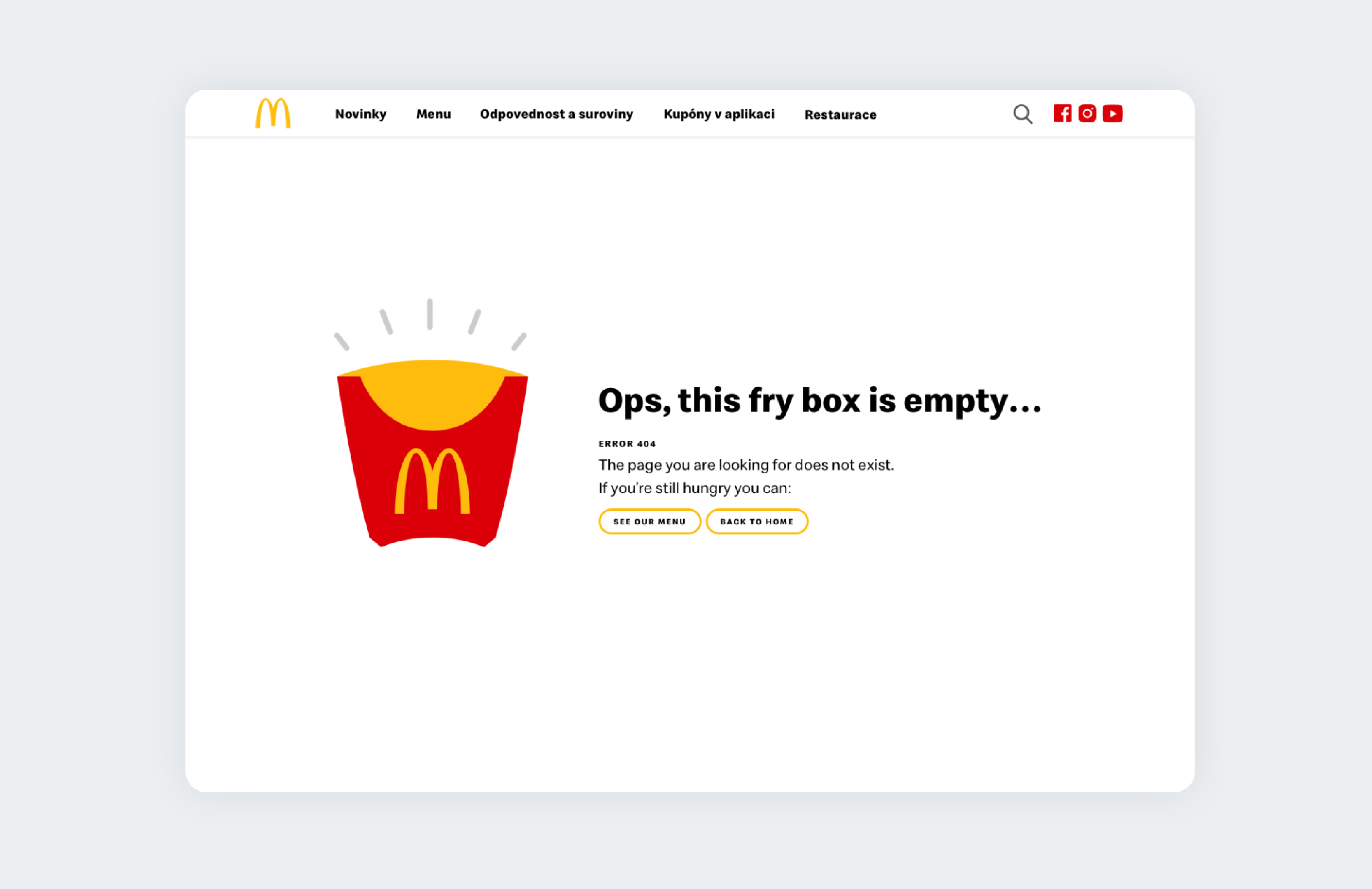
Even the 404 page matched the system
What made the redesign stronger
Prototype early
Testing structure early kept the team from polishing the wrong flow.
Test across teams
Different departments surfaced different pain points that improved the final experience.
Bring leadership in
Stakeholder alignment helped decisions move faster and stay consistent.